 Move
Move
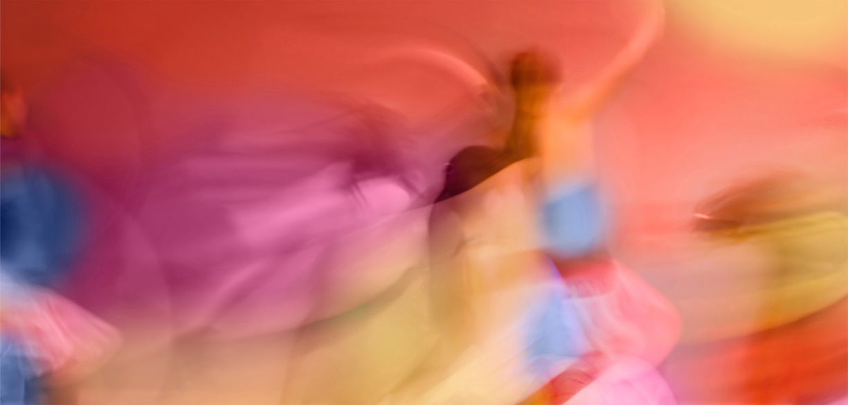
The Move palette represents the natural element water.
Move like water, over rocks, down a cliff, through crevices, over pathways carved out by time. Move as one with the world, and transform as the situation demands—to be liquid when flowing is the best course of action, to be ice when there is a need to make a stand, to be steam when the call is to rise above. Move around the vastness of the life that has been given. Move beyond the limits set by the mind. Move inward and outward. Move alone or as one with the community. Move to make this world a better place for all of us.
This palette is made up of 50% cool colors—blue, grey, and white, and 50% warm colors—yellow, purple, and orange. The combination of warm and cool hues gives the visual motion to create a playful, lighthearted vibe. Half stimulation and half respite adds up to make an interior space that gives freedom to a spirit that wants to realize a purposeful intention tempered by good-natured effort.
